Seems like only yesterday that we launched our 50th website . . . but now we’re up to 100+ and still going strong! And not only have we launched over 100 websites, but we’ve launched over 100 mobile-friendly websites.
Why is it important to have a mobile-friendly website? On sites that aren’t mobile friendly, you’ll get one of two things when you try to access the site on a mobile device:
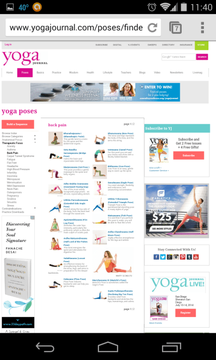
1. A shrunk-down version of the original site that is usually so small you can’t read anything. You have to pinch to zoom in and scroll back and forth in order to read the content.

2. A version of the site that is zoomed in so you can read everything, but you have to scroll back and forth and up and down in order to read text or see images. It’s impossible to get everything you want to see on the screen at one time.

On a mobile responsive site, all text and images are automatically re-arranged and re-sized, so they are customized to your screen and you can see everything on the site and read text without having to zoom or scroll left and right. This makes for a much easier user experience.

Here are some of the steps we take to make sure our websites work well in today’s always-on-the-go, digital world:
1. We build our websites with WordPress and always use themes that are mobile responsive. As their name implies, “responsive” themes respond to the screen they are being viewed on—whether that’s a cell phone, tablet, or computer—and adjust accordingly. If your website doesn’t have a responsive theme, it may look different (and not good different) on screens of other sizes.
2. As we’re building a website, we ensure the content is mobile friendly. For example, images will adjust to the user’s screen size, rather than require the user to scroll to the right or left to see the other side of an image.
3. After we’ve added all the content and made a site live, we do a quick SEO review and a mobile compatibility check to make sure everything looks and functions like it’s supposed to.
4. We test all of our websites on several different mobile devices, including iPhone (3.5″ screen), Nexus 7 (7″ screen), and iPad (9.7″ screen). Our web team has a library of devices that they use to browse through all the pages of a new site and ensure the headings, text, images, and menu are all readable on the screen.
Check out some of our most recently launched websites (on a device of your choosing!) and let us know what you think!
Lake Norman Signature Pools & Patios
AC Guys Cooling & Heating Services
—
WordJack Media provides a wide range of website design and online marketing solutions to clients throughout Canada and the US, including Collingwood ON, Ottawa ON, Barrie ON, Miami FL, Lakeland FL, Orlando FL, Charlotte NC, Hickory NC, Asheville NC and more. Contact WordJack Media today for more information about how we can help your business win on the web!

